
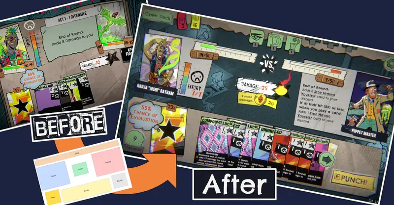
Crow Loop Studio's very first client project wasn't a game built from scratch. It was a UI review: helping Green Parrot Games make the battle screen and buttons of Lucky Punk readable, without sanding off a single bit of its punk attitude.
Lucky Punk is a push-your-luck roguelike deckbuilder. Every turn you decide: draw another card and risk it, or stop and play it safe. Where most card battlers hide the randomness, Lucky Punk always shows you the odds. Its own tagline nails it: 1% chance. 100% choice. It's set in a vibrant punk-pocalypse full of strange plants and creatures, with a rebellious hope-punk attitude, and the art is fantastic. It launched on Steam on 4 November 2026, and you should go play it.
Building a game around a brand-new mechanic is hard, and so is making its user experience feel right. After months of work on it, project blindness sets in. That's when a fresh look from someone focused purely on UI and UX pays off. Green Parrot Games brought me in for exactly that: a two-day UI review. Plain old craft, by the way: no AI was involved anywhere in this project.
I got the call thanks to Thomas Rössig, my former boss at Flying Sheep Studios, who brought me into the project. Honestly, that one means a lot. When someone who has shipped games with you for years puts your name forward, it says your work held up. For a brand-new studio, there's no better start.
The problem: great style, hard to read
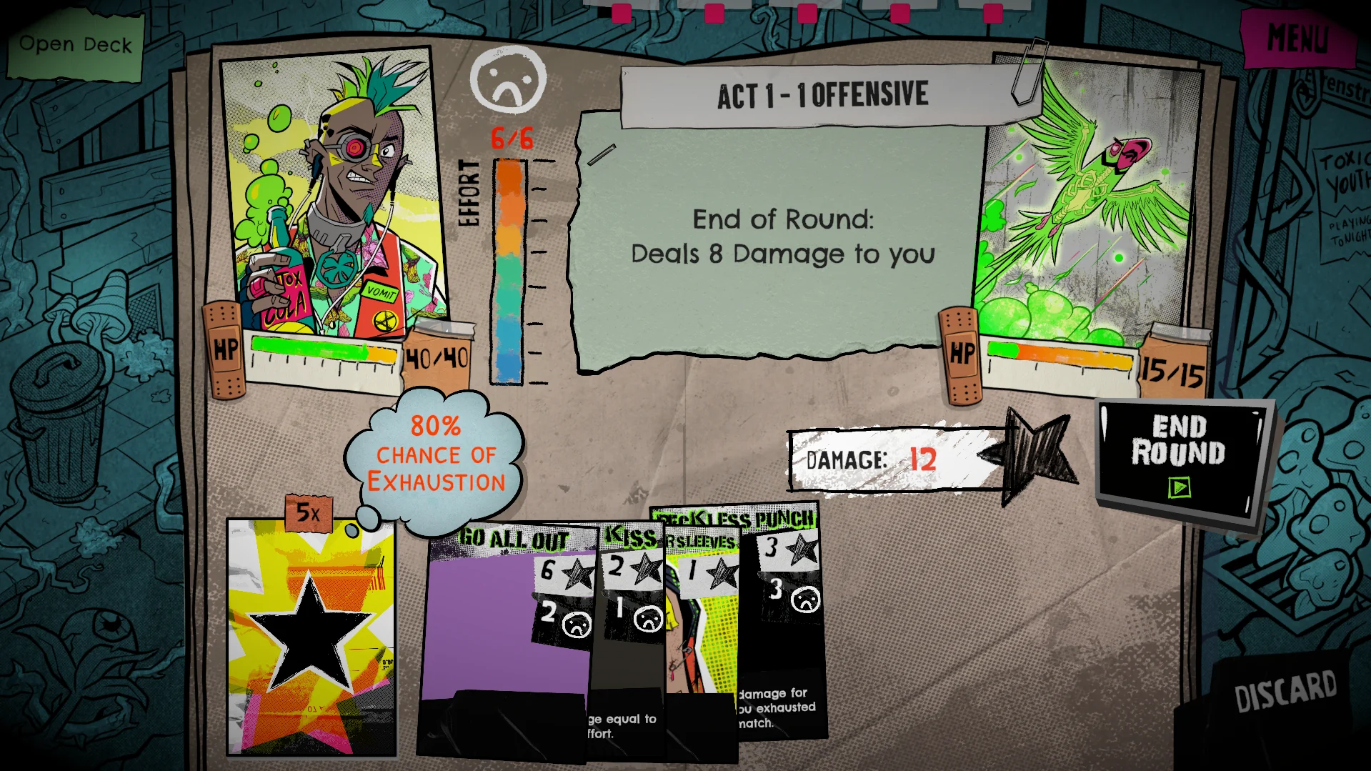
Lucky Punk's UI style fit the theme perfectly: wild, punky, rocky, full of tactile paper and tape textures. That's also what made it hard to read. In a card game, the player constantly scans for odds, damage, health and card text, and every texture competes with that information.
The team had two concrete pain points:
- Players couldn't tell what was clickable. Interactive areas didn't read as interactive.
- The battle screen was hard to parse. That's where cards are played and where most of the game happens.
Step 1: buttons you can actually find
I started with the buttons, because the cause was simple once I lined them up: nearly every button had its own shape and its own colour. With no common pattern, nothing told the player "this is the thing you click".
So I built a few button styles that stayed true to the game's handmade look, from comic print to paper cut to a chunky cut-out. I mocked them up as first drafts on a real screen and picked the best fit together with the team.
The final style ended up as a mix of comic and paper cut, combining their colours, halftone dots and borders. It took several more rounds of iteration with the team to get there.
From there I set a few small rules:
- One shape language. Buttons look like buttons, everywhere in the game.
- A clear colour role. A defined palette for what's clickable, and for which action matters most.
- A contrasting outline. A thin border lifts each button off whatever is behind it, so it works on any background.
- A halftone dot pattern. The raster-dot print effect keeps buttons comic-book and punk, so readable never turns into generic.
Step 2: a battle screen you can read from a stream
The brief for the battle screen came with a great test: if someone shows Lucky Punk on a stream, a card-game fan watching should find their way around instantly. Where's my draw pile? Where's the enemy? Where are the stats? Where's my hand?
Research first. I looked at how a range of card games lay out their battle screens, because players carry those conventions with them. Then I looked at Lucky Punk itself. Its rules shape the UI as much as any convention does, so I read them and played the game several times before moving anything.
Then a wireframe. Before touching art, I blocked out where each kind of information lives: meta info up top, player and enemy facing off with the current action between them, and piles, hand and the end-round button along the bottom.
Then the rebuild, together with the team, reusing their existing elements wherever possible. The key changes:
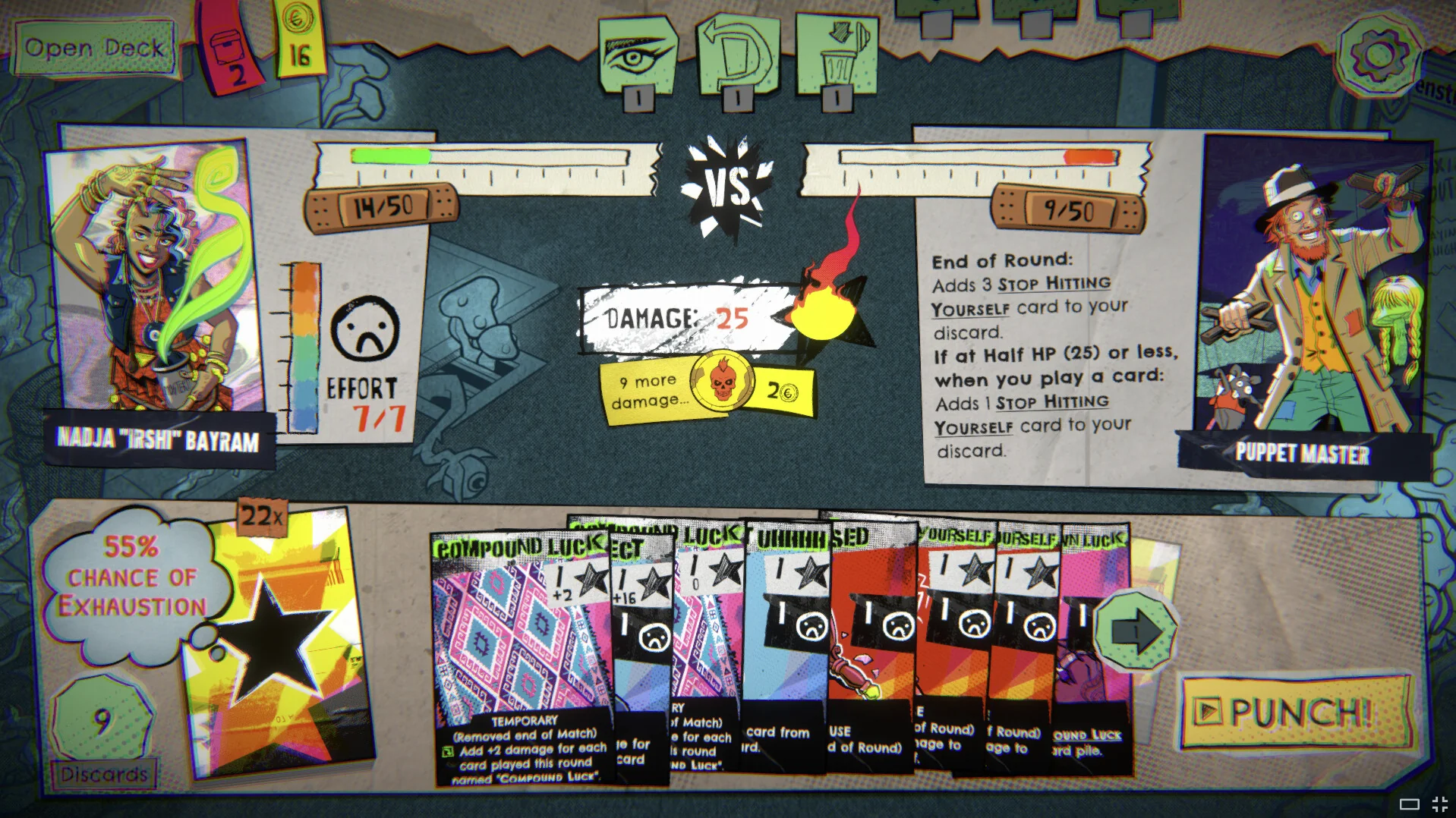
- Edge cases handled. With lots of cards in hand, the hand used to run off the screen, the kind of edge case that's easy to miss. It now stays in its area, with arrows to scroll through it.
- Clear health bars. It's always obvious which bar is yours and which is the enemy's.
- Clearer piles and round controls. Draw pile, discards and End Round are easy to spot.
- Overkill moved centre stage. Overkill is a key mechanic for earning resources, but it was tucked away on the enemy's side. It now sits right in the middle, under the damage counter.
- Bigger character art. The team's character illustrations are superb, and the feedback was to show them large. Your own character never changes during a fight; the enemies do. So the enemy got more room, with space for its description.
- A tintable background. I cleaned up the play area so the background behind the zones can be recoloured. Green Parrot can now vary it per enemy, say a different mood for a boss, and add variety at almost no cost.
What I took away
A strong art style and a readable UI aren't opposites. You don't fix readability by toning the punk down. You fix it by giving the punk a voice players can understand: one button language, a clear layout grounded in genre conventions, and room for the parts that matter. All of that fit into two days.
Big thanks to Green Parrot Games for trusting a brand-new studio with their baby. The game is a blast.